Bay 12 Games Forum

Please login or register.

Login with username, password and session length
Advanced search  
Pages: 1 2 [3] 4 5

Author Topic: New UI is shit.  (Read 13567 times)

Worlder

  • Bay Watcher
    • View Profile
Re: New UI is shit.
« Reply #30 on: April 23, 2024, 02:24:31 pm »

Hey hey I too was an outsider, and while learning the old controls was just fine, I do love using the mouse. In fact I use both the mouse and the keyboard at the same time, because, you know, I only need 1 hand on the mouse, my left hand is free to stroll anywhere on the keyboard. So I can quickly speed things up when it gets tedious with the mouse. So I would say it clearly is not so bad. In fact it combines the convenience of the mouse and the speed of the keyboard. The keyboard clearly is better to access menus, but the mouse shines at looking things and building stuff. And if longbeards could learn the old layout then they can absolutely learn the new controls.

Also, the mouse may be hard on the wrist, but I do not have any numpad, so using the keyboard is extra weird. Yeah, external numpads exist, but so do nice ergonomic mouses. I would rather invest in the latter because such a purchase on its own basically cancels the wrist issues. That being said, if anyone has a tip about playing the old controls without a numpad it would be much appreciated !

« Last Edit: April 23, 2024, 02:45:32 pm by Worlder »
Logged

brewer bob

  • Bay Watcher
  • euphoric due to inebriation
    • View Profile
Re: New UI is shit.
« Reply #31 on: April 23, 2024, 02:46:42 pm »

if anyone has a tip about playing the old controls without a numpad it would be much appreciated !

If you have arrow keys, those work. You just won't be able to use diagonals, which doesn't matter so much in Fort Mode.

(Or if you want to torture yourself, you can use number keys instead of a numpad. I actually did this for quite long with my old laptop before I finally went and got an external keyboard.)

Tomsod

  • Bay Watcher
    • View Profile
Re: New UI is shit.
« Reply #32 on: April 23, 2024, 02:48:49 pm »

AND THESE F*CKINGLY ORGANIZED STOCKS.

I'm even not speaking of scrolling speed, it's everywhere only with mouse wheel or clicks.

Have to press EVERY KIND OF MATERIAL just to see how many of it is.
And any containers like barrels/bags/bins/etc.

But the most UNDESCRIBABLE STUPID Prepared meals are shown.
To be fair, v0.47, also showed all prepared meals as "prepared meals [х]" until you hit Tab, which was stupid too.  If you must click on each one separately now it's indeed a bad change, but meals specifically were always like that.
Logged

Grax

  • Bay Watcher
  • The Only.
    • View Profile
Re: New UI is shit.
« Reply #33 on: April 24, 2024, 06:42:37 am »

And a question about 47.05.

Tried every combination of init:
Code: [Select]
[WINDOWEDX:96]   1920
[WINDOWEDY:49]    990
[FONT:rose20.png]

You may disable window resizing if you wish.
[RESIZABLE:YES] NO

Full screen info.  The 0s below mean that the game will choose a resolution for you, but you can set it yourself as well.

[FULLSCREENX:0] 1920
[FULLSCREENY:0] 1080
[FULLFONT:zara16.png]

If this is set to NO, tiles will be stretched to fit the screen if there is a resolution mismatch.
If this is set to YES, the tiles will not be stretched, but rather the game view will be centralized, surrounded by black space.  Tiles that are too large will always be compressed rather than running off the screen.

[BLACK_SPACE:YES] NO

[GRAPHICS:YES] NO
[GRAPHICS_WINDOWEDX:1920] 96
[GRAPHICS_WINDOWEDY:990] 49
[GRAPHICS_FONT:rose20.png]
[GRAPHICS_FULLSCREENX:1920] 96
[GRAPHICS_FULLSCREENY:1080] 54
[GRAPHICS_FULLFONT:zara16.png]
[GRAPHICS_BLACK_SPACE:YES] NO

But it draws fonts scaled to 80xNN grid.
Like this zoomed.
Windowed not zoomed to screen:


Window zoomed to fit screen:


Older 45.xx on 2560x1440 display just draw a game screen with a 128x70 grid without stretching font.
Logged
Finis sanctificat media.

Goldbeard

  • Bay Watcher
    • View Profile
Re: New UI is shit.
« Reply #34 on: April 24, 2024, 08:05:43 pm »

Yes, the brothers' need for money is totally legit and I can't blame them for needing a larger pool of buyers.
It's just sad for those older fans like us that get left behind.

World is ruled by money.
...

When its compensation for labor, I expect everyone to go where the money is, including Toady. I even want him to; I want him to have a comfortable life and keep coding, not have to choose between a day job and coding under an overpass.

I just can't follow him there to 50+. Ingrained habit certainly is part of that, but not all of it. The Steam UI is not all that great in a positive sense, even without comparing it to legacy. It is mouse capable, so mission accomplished, but its not elegant mouse capable, for reasons already pointed out.

Separately, and speaking of money, I would pay or donate $20 for a bug fix only pass of 47.05, with no added functions and no change to UI.

I neither expect that, nor am I owed it. In the abstract I even want him to deliver value for his Steam purchasers before he takes on any other missions - but again, I can't follow him there.
Logged

Grax

  • Bay Watcher
  • The Only.
    • View Profile
Re: New UI is shit.
« Reply #35 on: April 24, 2024, 11:48:38 pm »

I just can't follow him there to 50+. Ingrained habit certainly is part of that, but not all of it. The Steam UI is not all that great in a positive sense, even without comparing it to legacy. It is mouse capable, so mission accomplished, but its not elegant mouse capable, for reasons already pointed out.
The main problem of Toady - he's outstanding coder, but awful UI designer.

Both versions of UI is overcomplicated and non-intuitive for newbies.
But graphic UI is not only overcomplicated, it lacks visual usability.

Why there's no hotkeys shown on icons/pictograms? WHY?

Every level of menu must be hotkeyed with a key or sequence of keys (nesting level-dependent) to be pressed without mouse.
Like this:


Also, scrolling speed in stocks is awful and (WHY?) can't be modified in inits.

And strings are very height-consuming because of icons on left side.
With smaller icons and without line-dividers the quantity of strings in list can be doubled per screen.

Every item in stocks must be viewed not by magnifying glass, but right click (with changing "close-window" to Esc).
Centering on item with double-left-click.

OR viewed with double-left-click and centering with right-click closing the window.

And all these excessive strings marked red must be deleted.
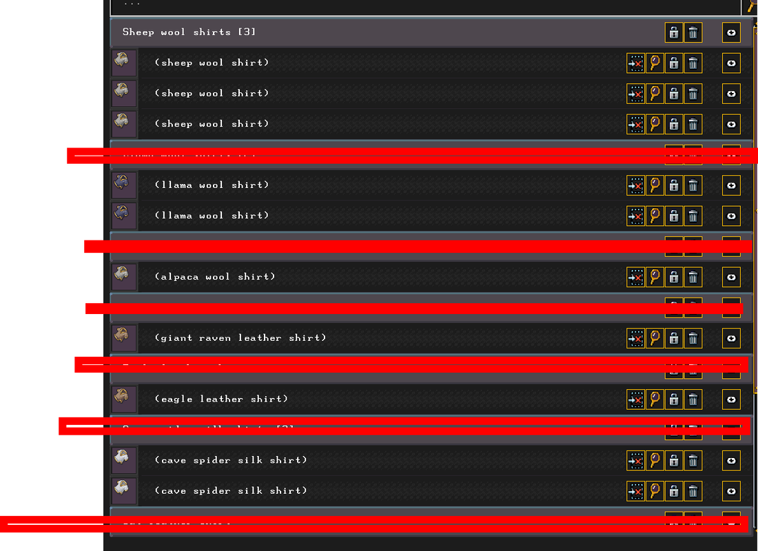

This is just a little bit of improvement that can be easily done (by Toady) to make new UI much more usable.

Also, sorting dwarves in labors have to stay permanent.
Logged
Finis sanctificat media.

eerr

  • Bay Watcher
    • View Profile
Re: New UI is shit.
« Reply #36 on: April 25, 2024, 08:20:37 pm »

I would just like to note, that while toady is bad at making ui, that the game itself is actually incredibly difficult to build ui for.

For one, making the wrong ui element breaks the player's immersion, and this results in way more cuts to seemingly prime features, than you might think.
Another is that interface created needs to serve new players, which means sacrifices must be made.
The interface also needs to work in both ascii and graphical versions of dwarf fortress, adding another wrench into the works.

it's not like the game has an eighteen-year legacy or anything like that...

Though personally I prefer the old style of ui being fire and forget, because it means a faster turnaround time for other features.
Logged

Worlder

  • Bay Watcher
    • View Profile
Re: New UI is shit.
« Reply #37 on: April 26, 2024, 10:31:48 am »

the game itself is actually incredibly difficult to build ui for.

Thank you for pointing that out. Also working on UI is often about sorting, which is partly about making quite arbitrary choices since stuff can be rightly sorted in many ways.

Though personally I prefer the old style of ui being fire and forget, because it means a faster turnaround time for other features.

I hope the new UI will get kind of more "modular" over time, so that it can get more "fire and forget" for a faster turnaround time.
Logged

TurboDwarf

  • Bay Watcher
  • Pangolins are kind of dwarfy, right?
    • View Profile
Re: New UI is shit.
« Reply #38 on: April 26, 2024, 12:34:29 pm »

The new UI took a bit getting used to but to say that it makes the game unplayable is pretty nonsensical. It's clearly playable, and people are playing it right now. It's a bit less info dense and a bit more mouse-centric which hurts the computer nerd in me, but I do feel the new UI is a good thing in the long term to make the game more accessible overall.

Eric Blank

  • Bay Watcher
  • *Remain calm*
    • View Profile
Re: New UI is shit.
« Reply #39 on: April 26, 2024, 04:49:36 pm »

if anyone has a tip about playing the old controls without a numpad it would be much appreciated !

If you have arrow keys, those work. You just won't be able to use diagonals, which doesn't matter so much in Fort Mode.

(Or if you want to torture yourself, you can use number keys instead of a numpad. I actually did this for quite long with my old laptop before I finally went and got an external keyboard.)

The number keys (1, 3, 7, and 9) above the letters, actually work for diagonal movement too, not just the numpad. A bit weirder than using a numpad, but you CAN move diagonally.
Logged
I make Spellcrafts!
I have no idea where anything is. I have no idea what anything does. This is not merely a madhouse designed by a madman, but a madhouse designed by many madmen, each with an intense hatred for the previous madman's unique flavour of madness.

brewer bob

  • Bay Watcher
  • euphoric due to inebriation
    • View Profile
Re: New UI is shit.
« Reply #40 on: April 27, 2024, 12:57:00 am »

The number keys (1, 3, 7, and 9) above the letters, actually work for diagonal movement too, not just the numpad. A bit weirder than using a numpad, but you CAN move diagonally.

And you eventually get used to it and ingrained in your muscle memory. Then there is no need for a numpad and you laugh at weaklings who use one.

anewaname

  • Bay Watcher
  • The mattock... My choice for problem solving.
    • View Profile
Re: New UI is shit.
« Reply #41 on: April 27, 2024, 09:15:54 am »

...
And you eventually get used to it and ingrained in your muscle memory. Then there is no need for a numpad and you laugh at weaklings who use one.
I fought the habits I created in my own mind and body, and won! My past self was a weakling... Swagger swagger swagger, all day long...

It is always a laugh when I catch myself doing this.
Logged
Quote from: dragdeler
There is something to be said about, if the stakes are as high, maybe reconsider your certitudes. One has to be aggressively allistic to feel entitled to be able to trust. But it won't happen to me, my bit doesn't count etc etc... Just saying, after my recent experiences I couldn't trust the public if I wanted to. People got their risk assessment neurons rotten and replaced with game theory. Folks walk around like fat turkeys taunting the world to slaughter them.

Vagabundo

  • Bay Watcher
    • View Profile
Re: New UI is shit.
« Reply #42 on: May 23, 2024, 08:52:55 am »

I'm sad I can't get into the new UI. I am happy its been such a success.

I miss the old tileset as well and the lnp to configure everything and hack stuff was awesome.

Old timer, kind of lost with the new version.
Logged

Nordlicht

  • Bay Watcher
  • Wuschelig & Wunderlich
    • View Profile
Re: New UI is shit.
« Reply #43 on: May 23, 2024, 10:33:19 am »

And. Graphic mode eats 35-40% CPU even on pause. In background behind other windows.

Imho Graphics and UI eat a lot of Dev time too, altough we will see how it works on the long run. They at least enabled Putnam to join the team.

I'm still not sure if graphics will prevent certain features, simply because displaying them graphically in a satisfactory way is either too time consuming or outright impossible.

And that the UI needs time to evolve was to be expected for a complex game and Toady not really having made one before.

Logged

Worlder

  • Bay Watcher
    • View Profile
Re: New UI is shit.
« Reply #44 on: May 24, 2024, 12:57:43 pm »

Imho Graphics and UI eat a lot of Dev time too, altough we will see how it works on the long run.

Yeah, fingers crossed for content over graphics !
Logged
Pages: 1 2 [3] 4 5